On the days of national elections in the USA, and during the weeks leading up to and the days following, television viewers are bombarded with maps, most often dominated by the colors of bright blue and red. Maps are used to help provide us quick pictures of campaign trends, report exit polls and actual vote counts, and slice and dice the electorate.
CNN’s John King seems to have by far the fanciest maps and the most fun with all this, putting a “Magic Wall” in motion to take us instantly to a map of data from any electoral district in any state, with only a slight tap of his finger. Perhaps he also clicks his heels together…..if so, CNN doesn’t show that.
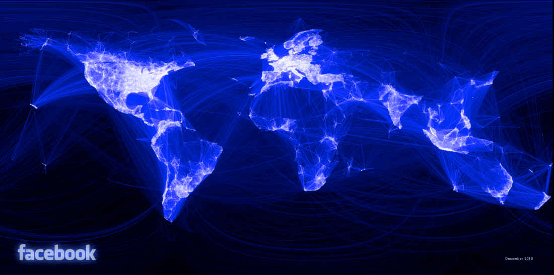
As I write this I am slogging through Simon Garfield’s book “On the Map — A Mind-Expanding Exploration of the Way the World Looks.” Most fascinating so far is a report on the 2010 initiative of a Facebook intern to map connections of some 500 million users all at once. The result is blue lines and white patterns on a dark background. The white patches are brighter where Facebook users are more concentrated, creating on the basis of the connections alone, eerily accurate outlines of the earth’s land masses as we know them.
North America, Central America, India, Europe, Australia, New Zealand, Japan, most of Southeast Asia and Indonesia and portions of South America and Africa are among the land masses most clearly defined by this process.
But missing entirely….completely dark spaces on this “map”…..is where we would expect to locate Russia and China and North Korea.
The picture that results provides more than a hint of the places around our planet where communications flow more freely and, either as cause or effect (I’m not sure which), freedom shines more brightly.
JER
