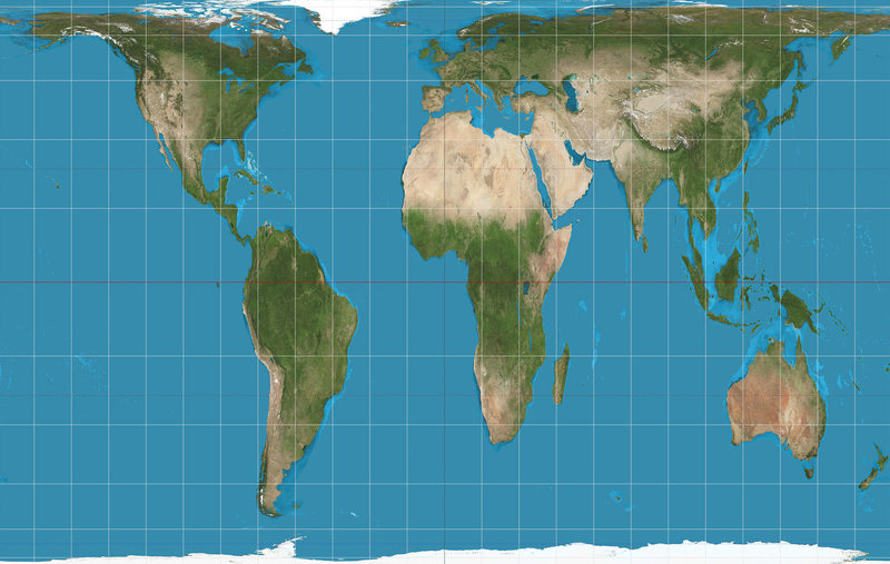
The flat map of the world to which most of us were introduced in school and at home is inaccurate. The globe on our teacher’s desk probably was correct, but the flat map in textbooks or affixed to the wall or pulled down like a movie screen in the front of the classroom likely was not. It significantly oversized some countries and undersized others.
Compare Africa, Australia and Greenland. They appear quite similar in size on the typical flat map; but, in fact, Australia is thee times larger than Greenland, and Africa is more than twelve times larger.
Some people posit that this is the result of a cultural bias toward the ethnic groups of the Northern Hemisphere, and it is certainly true that most of the earliest mass-produced world maps are the results of efforts by persons who have lived north of the equator. Others suggest that this is a bias against civilizations of the Southern Hemisphere; and certainly there were magnificently accomplished cultures which have vanished…..some vanquished by violence and/or viruses brought by invaders from the Northern Hemisphere.
The map we grew up with and still use most often is called the “Mercator” world map. It places a sphere on a flat page, the result of which are distortions which we assume are accurate depictions. They are not.
This map gets its name from the Flemish geographer and cartographer Gerardus Mercator who lived in the 1500’s and first projected a cylindrical map onto a flat surface. It had the advantage of presenting the planet’s latitude and longitude in straight lines and right angles, but it distorts the actual size of objects…..they become larger the farther they are from the equator. At more than 70 degrees north or south of the equator the distortions render the map almost unusable, which partially explains why parts of the Article Circle, Antarctica and Greenland are often omitted from the flat map presentation.
While the Mercator map was a major breakthrough for nautical navigators of the 16th Century, we should be able to do better for the rest of us world wanderers in the 21st Century.
JER
